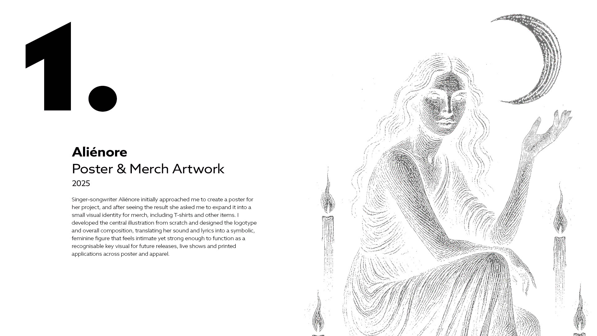
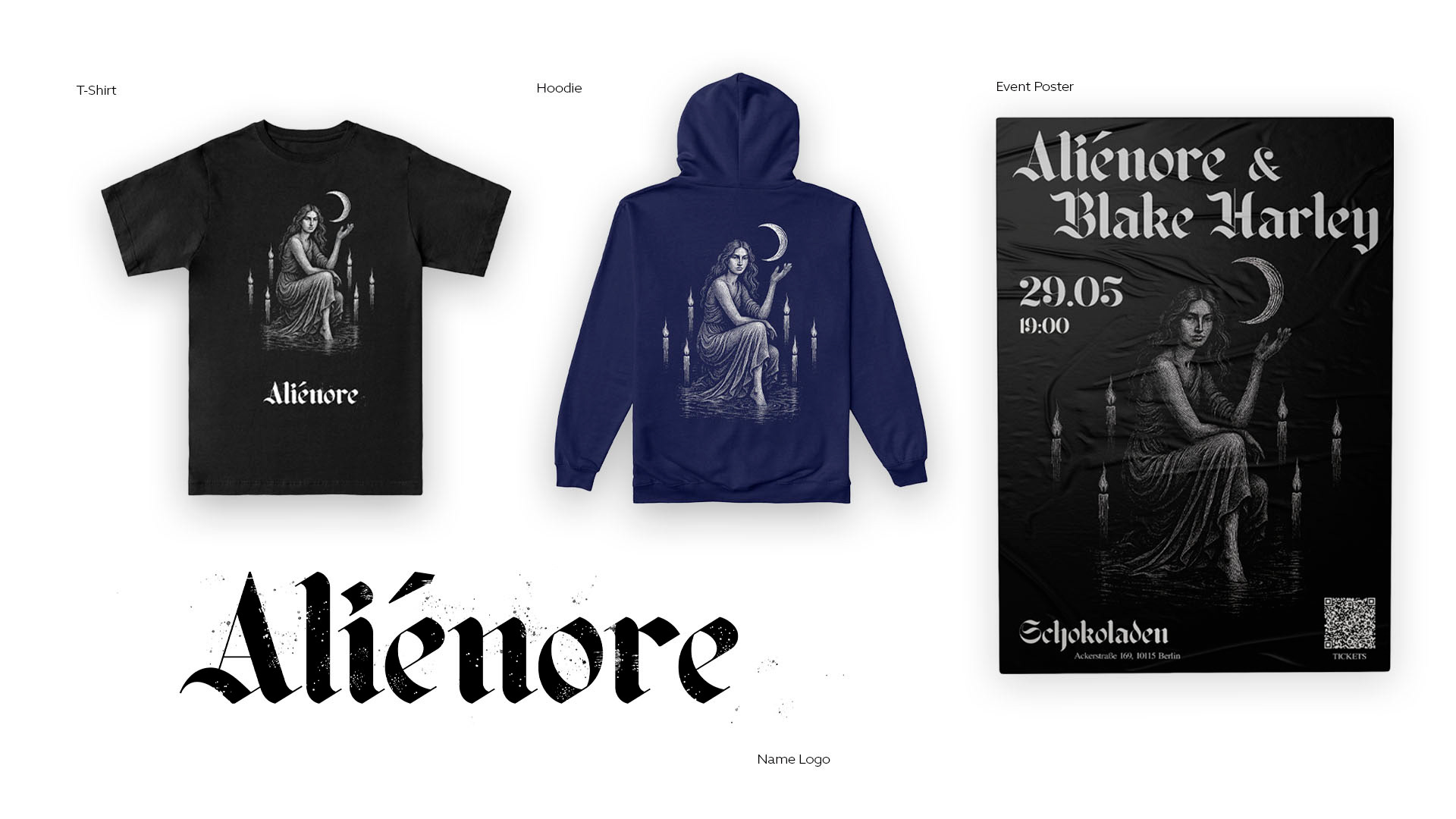
For Aliénore’s poster and merch identity, the central illustration and logotype became the base for her first small collection of T‑shirts and hoodies, with 20–30 pieces sold across early shows and online drops. The visual system now functions as a recognisable key image for future releases and live communication, giving her a consistent face across posters, apparel and social media.
Cassette Edition:
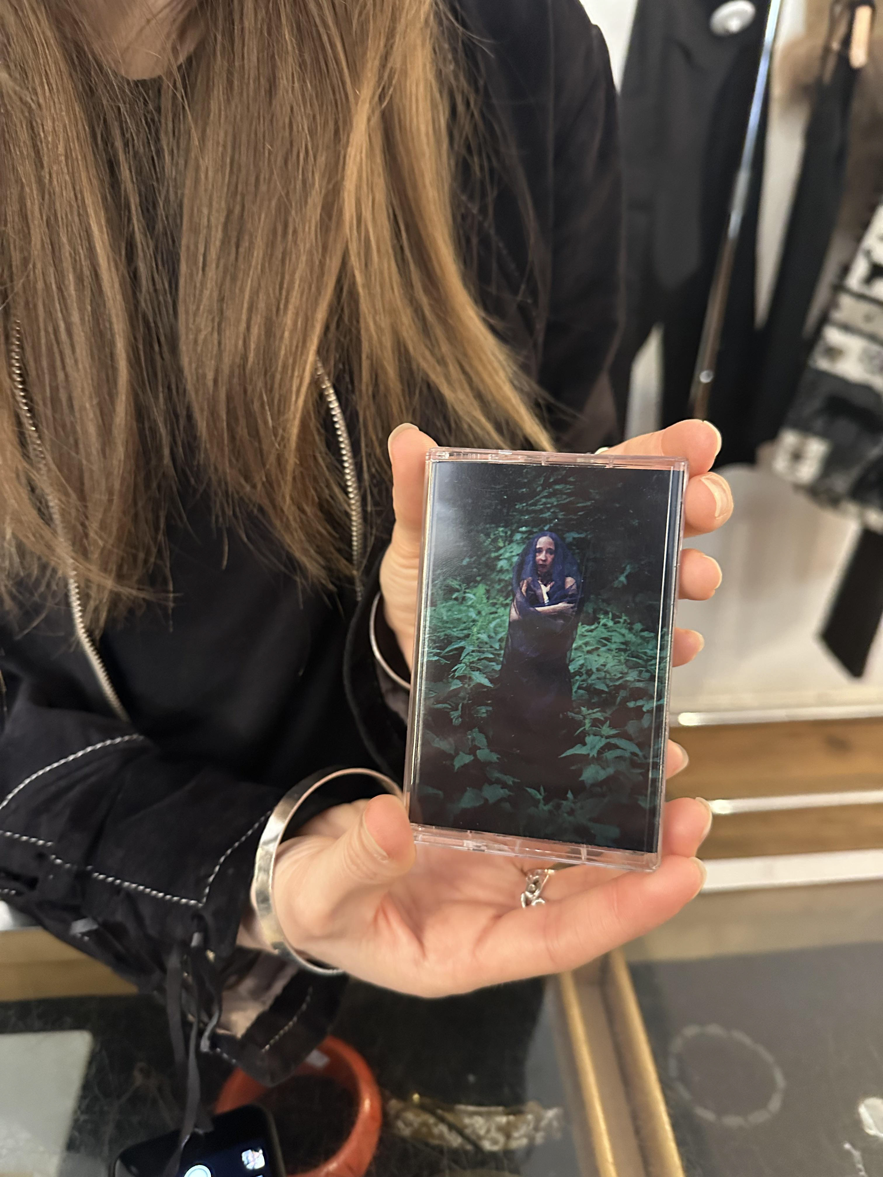
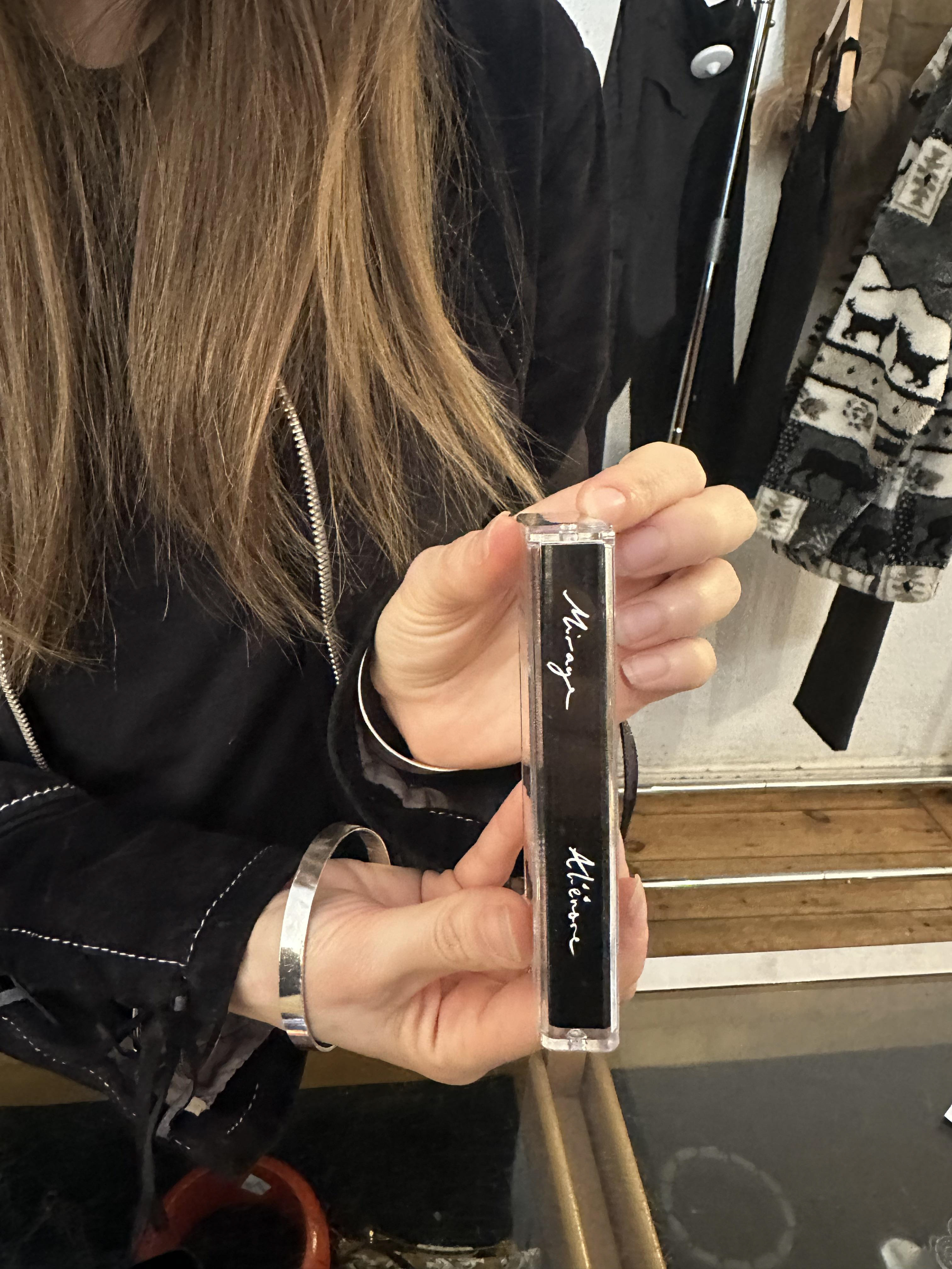
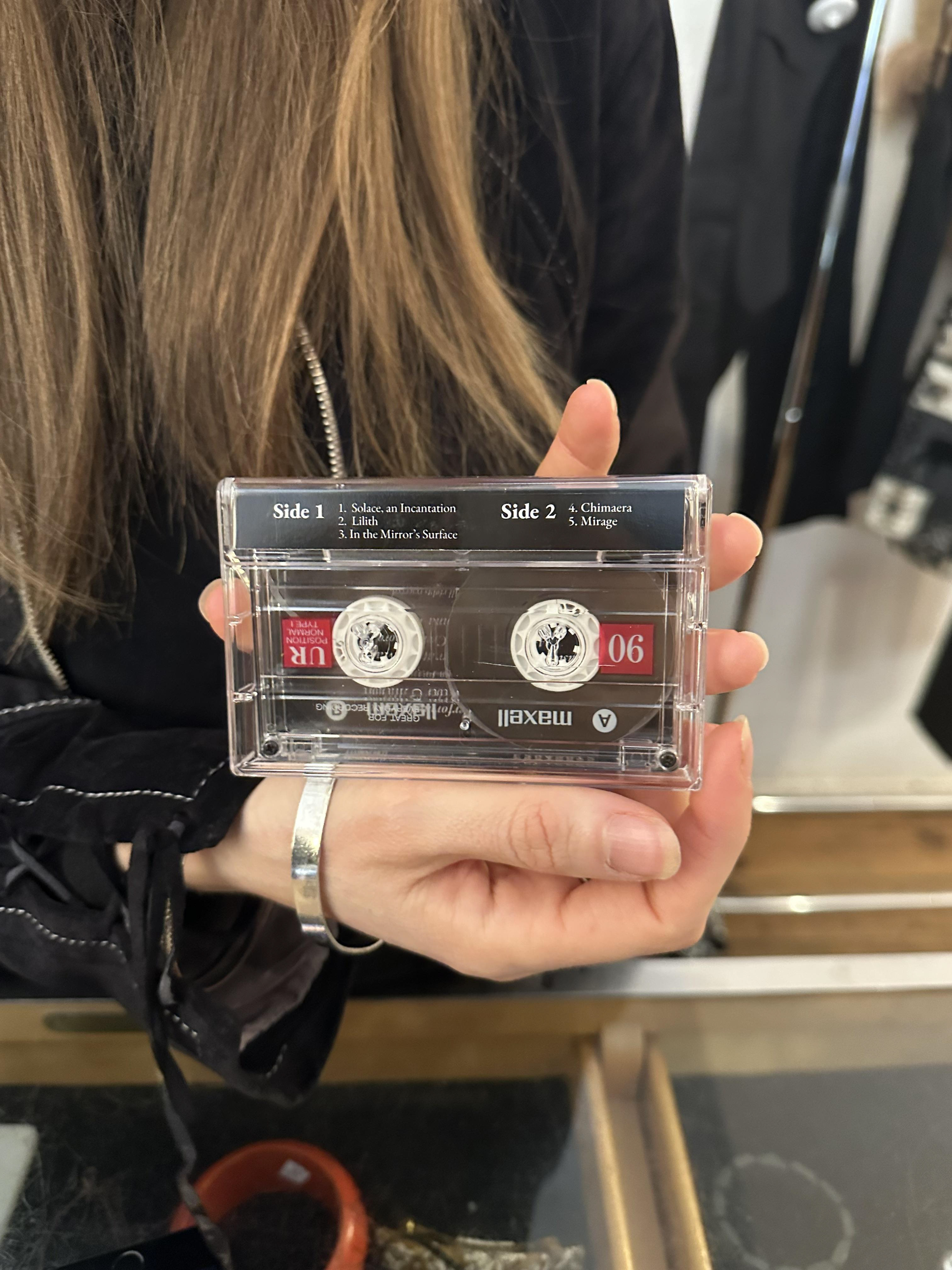
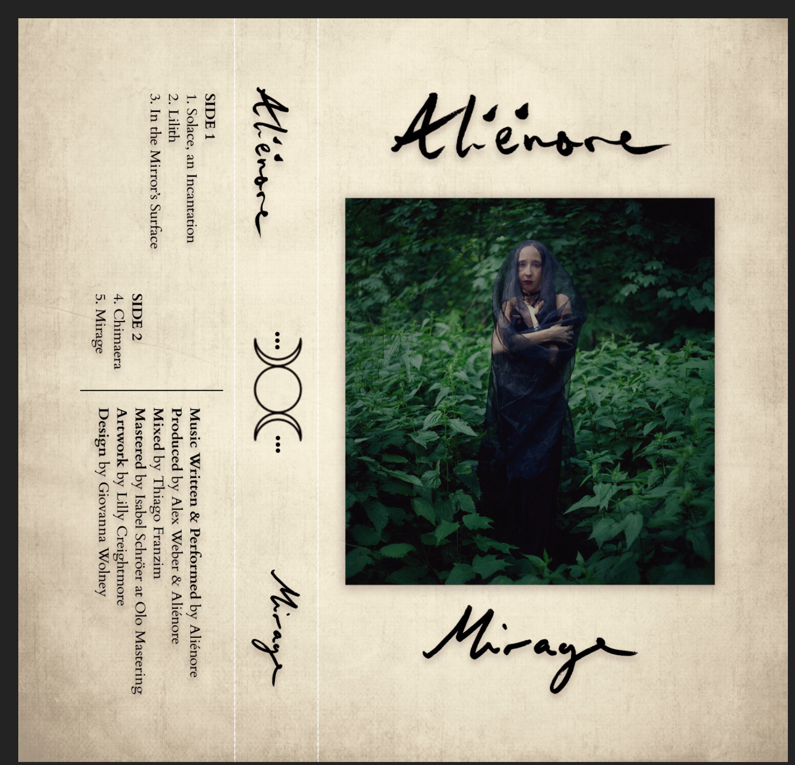
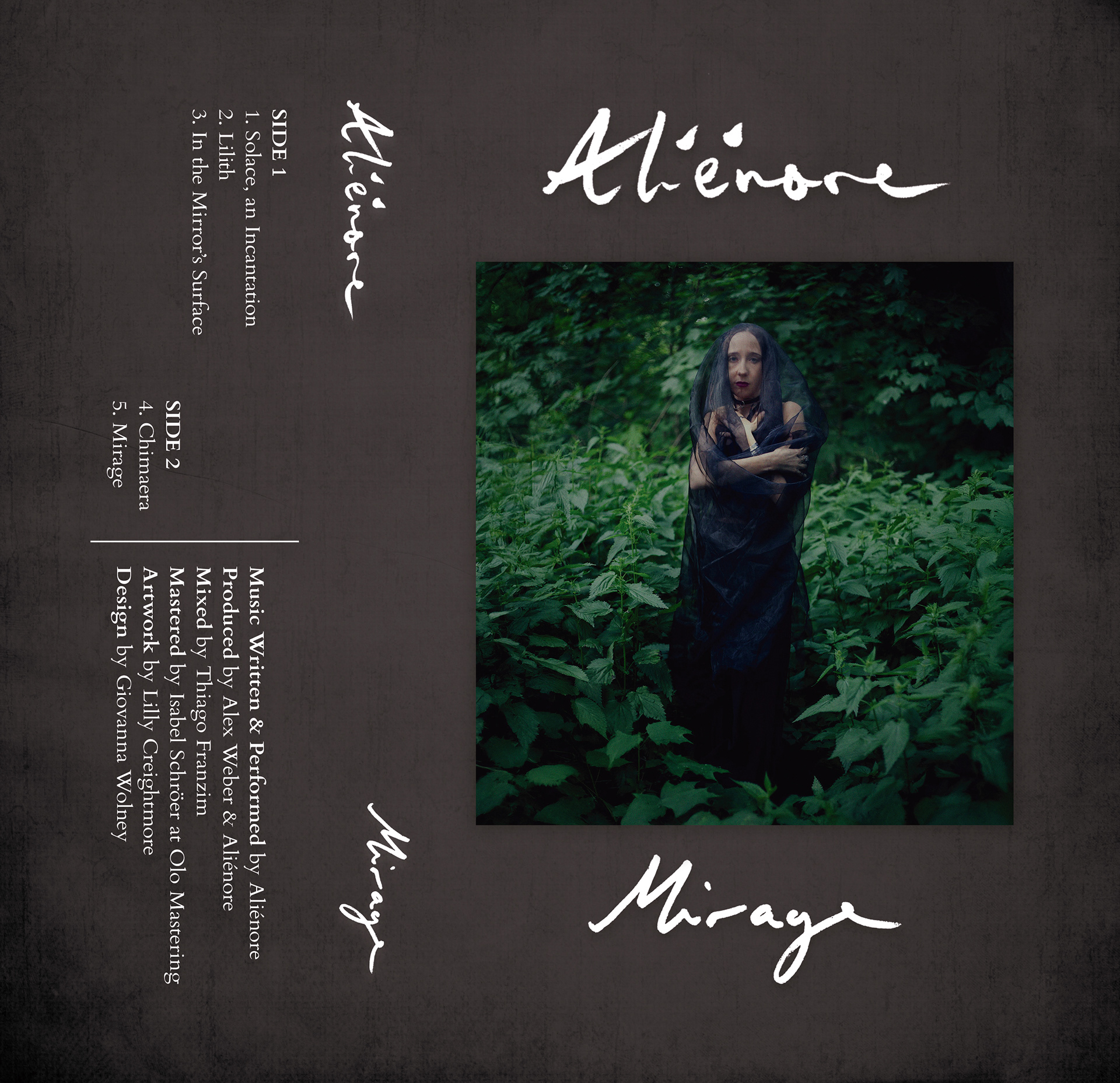
For the cassette edition of Mirage, I developed a series of layout variations around the same central photograph and handwritten typography. Each version pushes the balance between image, text and texture in a different way — from lighter, almost archival surfaces to darker, more atmospheric grounds, and from quieter compositions to ones where the title cuts across the portrait.
By showing all iterations side by side, the process becomes visible: how shifting background tone, type placement and the weight of the word “Mirage” changes the emotional read of the same image. In the end, we moved toward a more pared‑back final design, giving the photograph and Aliénore’s handwritten title room to breathe. The cassette artwork keeps the framing and credits structure, but lets the main image carry most of the narrative weight, aligning with her wish to place emphasis on her presence in the landscape rather than on graphic intervention.
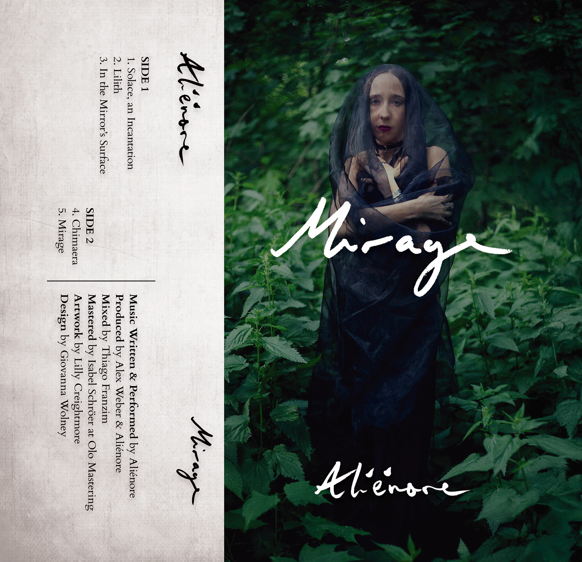
Final Result: